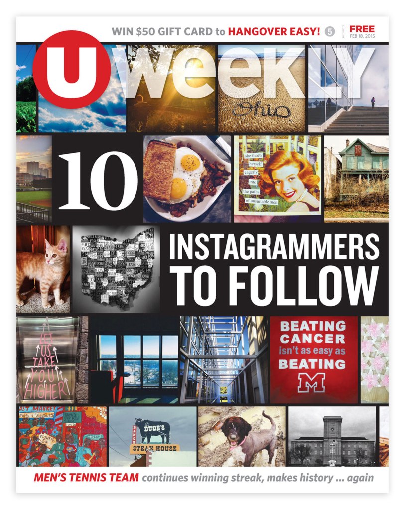
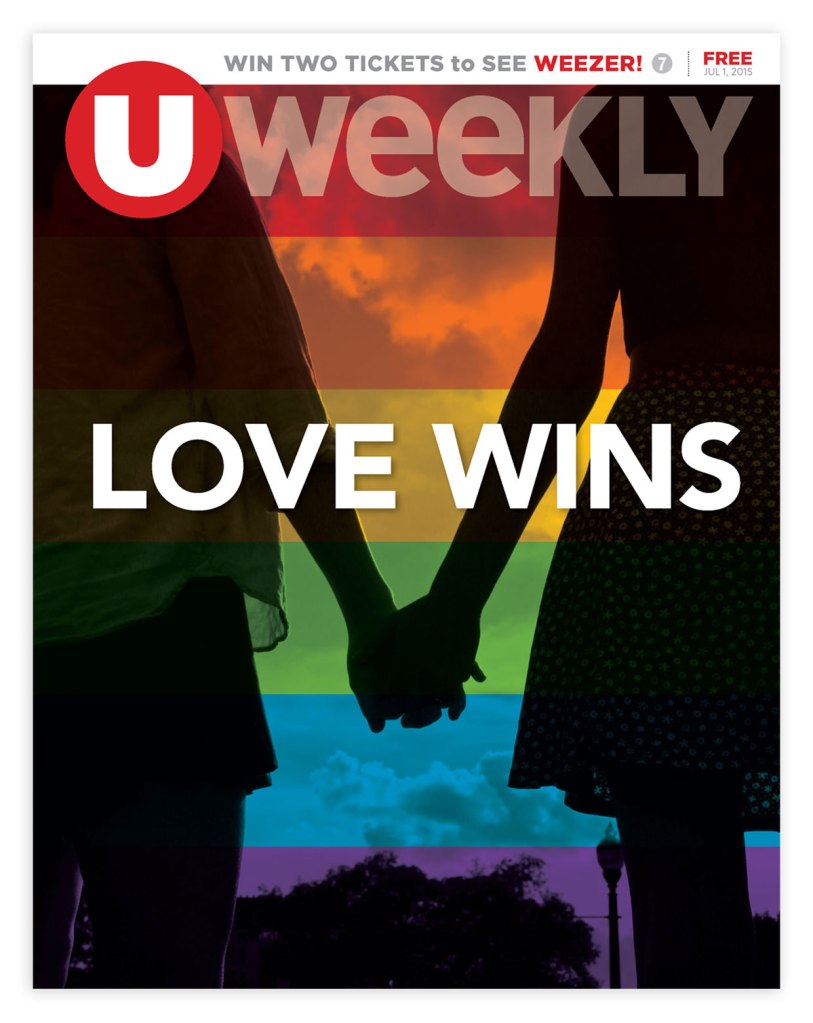
During my time at 614 Media Group, I designed this logo for the weekly magazine UWeekly (now a monthly magazine called 1870 Magazine), which primarily served the central portion of Columbus and the Ohio State University community. In 2014, UWeekly was in need of a rebrand. I used the red circle to emphasize the “U” because I felt that was the most essential part of the brand. This graphic element also served as a strong, simple graphic for the profile picture for all of UWeekly‘s social media accounts.
UWeekly Covers with Updated Logo
Once the new logo was finalized, I then implemented it into a refreshed front cover design. I designed all of the UWeekly covers shown below.